
Custom channel grouping in Looker Studio
Sometimes it might be insightful to compare how a specific group of channels or campaigns are performing compared to others. For example, you might want to check what share of traffic is related to branded campaigns and how performance compares to non-branded traffic or how a product X campaigns compares to the product Y campaigns over several online channels.
For this purpose, we can create a custom channel grouping to combine several channels or campaigns. In this quick example, I will show you how to do that in Looker Studio using Google Analytics data.
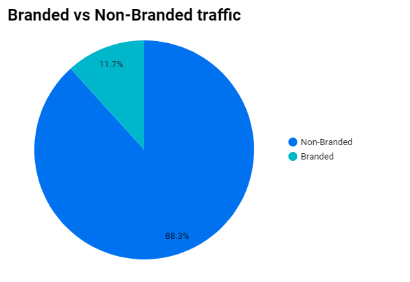
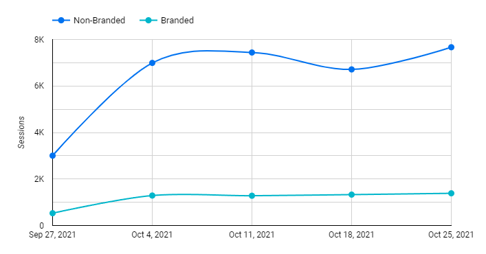
Here is what we are going to create:
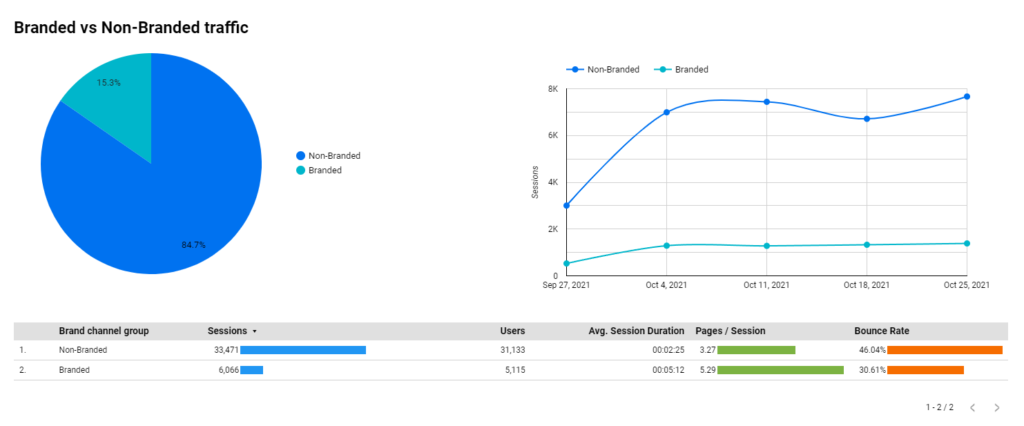
We will have a custom field that we can use as a filter or dimension on our data to split traffic into Branded or non-Branded sources. You can of course use it in other scenarios where you need to group any dimensions in Data Studio.
Step 1 – Define channel groups
Before we dive into the setup it is good to invest a couple of minutes to outline how you want to group your traffic, it will give you more clarity once you start defining groups in Data Studio.
In this example I will have 2 groups:
- Branded traffic
- Non-Branded traffic (other)
Branded traffic – I will consider traffic as branded if any of the conditions occur:
- I have a specific campaign name for my branded online paid channels. In this example, all branded campaigns will contain “Brand” in the GA “Campaign” parameter.
- Traffic is coming from the Direct channel.
- Traffic from Google organic search that landed on the homepage. (Since we can’t effectively filter all people who searched our brand name due to limited keyword stats in Google Analytics)
Due to the limited availability of data in Google Analytics, these conditions are based on subjective assumptions and can vary depending on the business. You can use it as a starting point and tailor it for your setup.
Non-branded traffic – Will show all visitors who don’t fall under the Branded group.
Now when conditions are clear, let’s apply it in our setup.
Step 2 – Create a calculated field
Open your Data Studio report where you want to output stats based on a custom channel group. Make sure you have added Google Analytics as a data source.
For your Google Analytics data source we will create a custom field that calculates which channel group it belongs to. This field can be reused as a regular dimension across any charts.
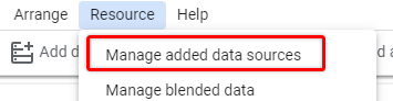
In the upper menu click on “Resources” and select “Manage added data sources”.
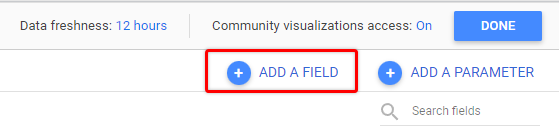
From the list pick the source that you want to use for your channel report and click “Edit”. I will use Google Analytics in my example

Next, we need to add a field that will group our data, so let’s select “ADD A FIELD” in the right top corner
Field name can be anything that makes sense to you.
For the formula, we want to use the CASE statement to define conditions that we outlined in Step 1.
CASE is a Data Studio function that returns specified value when certain conditions are met.
The syntax for CASE function might not be straight forward if you haven’t worked with SQL or any programming language, but luckily Google has plenty of examples in their documentation above and it just all makes sense if you try it once.
So the basic syntax looks like this:
CASEWHEN some-condition THEN result
WHEN other-condition THEN other-result
ELSE else-result
END
When you are using CASE you always need to provide the header (CASE) and the footer to close the statement (END).
In between you can define each condition by using WHEN and defining the value it should return after THEN.
And you can optionally provide ELSE statement and return some value if none of the conditions above were met.
Using template above, let’s shape our conditions as per requirements from Step 1.
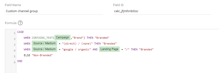
We will need 4 conditions here – 3 for branded and 1 for other traffic. Whenever we are matching a branded traffic source we will return a string “Branded” and in other scenarios – “Non-Branded”.
This is how adjusted CASE statement will look like.
For now we are keeping it abstract and using placeholder text instead of actual field names and operators.
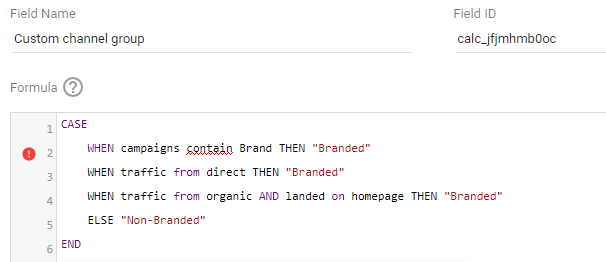
As you can see we have 3 WHEN conditions for “Branded” value and a backup value of “Non-Branded” for other scenarios. Pay attention that in order for your formula to work you need to return a string value here (or it can be one of the existing fields) that should always be surrounded by double quotes (example – “Value”).
Let’s tackle first condition – when campaign name contains “Brand”.
Google analytics stores campaign names under “Campaign” dimension, so we will use that, and we will also use another DataStudio function CONTAINS_TEXT to find specific string.
This is how our first condition will look like:
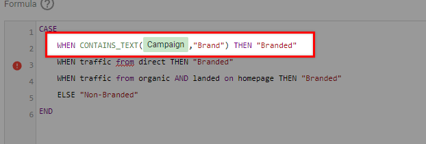
WHEN CONTAINS_TEXT(Campaign,”Brand”) THEN “Branded”
If you are following along and did everything correctly then you should see similar results. Google will highlight selected dimension, in this case it is Campaign where we are searching for string “Brand” using CONTAINS_TEXT function.
If we find “Brand” in Campaign field then returned value will be “Branded”.
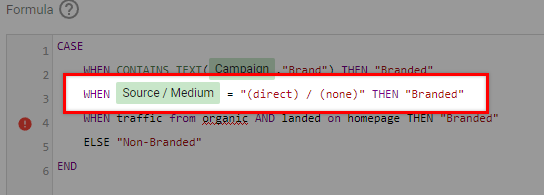
Ok, let’s do the same for the direct traffic scenario. Here we can just use equals sign (=) and Source/Medium. In Google Analytics direct (or unidentified) traffic will always be marked as “(direct) / (none)”.
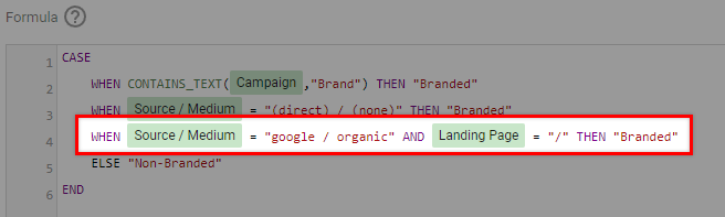
Lastly we need to define a condition when user comes from Google Organic and their landing page is homepage. The easiest way would be to use same Source / Medium field and match it to “google / organic”.
In addition to that we will use AND operator to add rule – Landing page equals “/”. If your main website page has different path like “/home” then you should use that instead of “/”.
The final condition will look like this:
And this is our final result that we will now save and proceed to the fun part – applying field to charts 🙂
Step 3 – Apply custom group to your charts
After a custom field was created we should be able to use it in any chart as a regular Google Analytics field.
Click on one of your existing charts or create a new one, and pick Google Analytics as a source. Then click on add new dimension and search for our new field name. In my case it was “Custom channel group”.
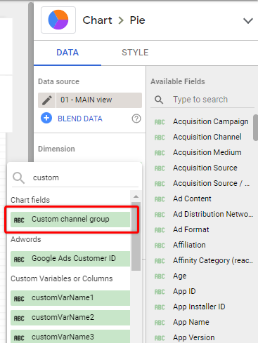
Then pick a metric, for example Sessions, and you should be able to see you data grouped by a custom channel!
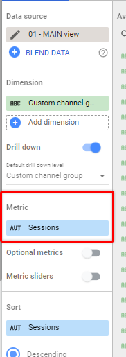
Congratulations! Now you can use this field in any charts that are using the same data source and Google will aggregate all the metrics to match specified conditions.

Final thoughts
This approach is not limited to a custom channel grouping or Google Analytics, you can use CASE statement to group any kind of custom dimensions to get desired reports relatively easy. This method also doesn’t require to make changes in the original dataset or gather more data points which makes it even more appealing.
I hope you will find it useful one way or another and happy CASEing!
