
Create a Looker Studio funnel report
Google Looker Studio doesn’t have built-in functionality to easily create funnel visualizations at the moment. To create such reports we are either left with limited community visualizations or exploring workarounds using available functionality.
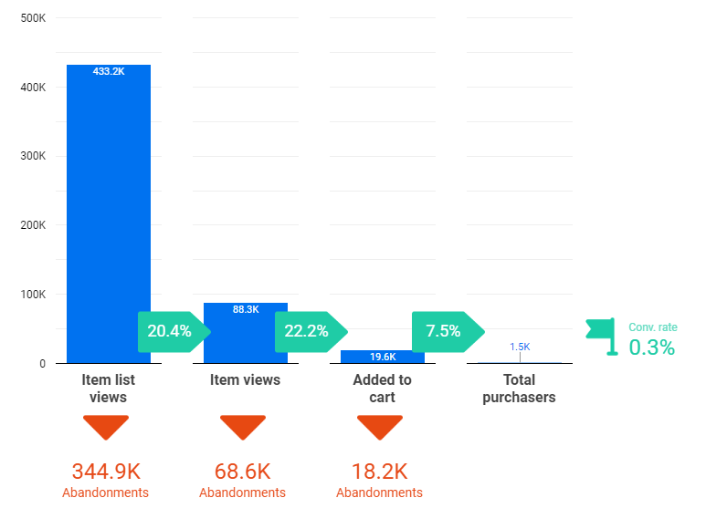
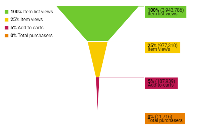
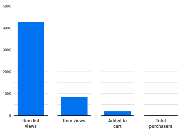
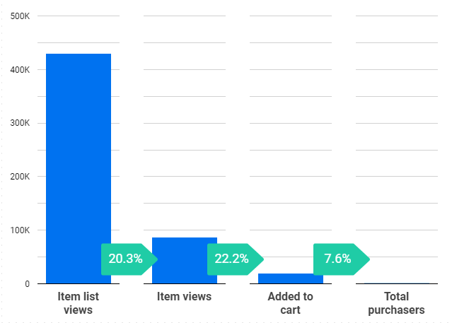
In this post, I will show one way we can create customizable funnels in Looker Studio using default elements like bar charts, scorecards, and custom images. This is the end result of what we are going to create:
Multiple ways to build a funnel report
Before you start doing any custom workarounds I think it is worth mentioning other alternatives out there, since those might be just enough for your use case.
As mentioned above, there are basically two ways you can create a funnel report in Data Studio:
Using community visualizations
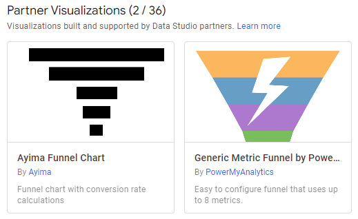
Before building anything from scratch, you could take a look at two default community visualizations that are available at the moment:
- Ayima Funnel Chart
- Metric Funnel by PowerMyAnalytics
While they can be used to quickly drag and drop any metric and have a ready funnel you will quickly notice limitations when it comes to visual appearance.
Ayima Funnel Chart
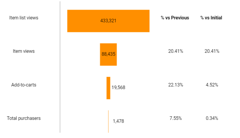
The chart above can be prepared in less than a minute. The only things that you can customize here are colors, fonts and whether you want to show “% from Previous” step or “% vs Initial” step.
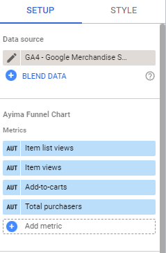
Metrics can be selected easily for each step and it might be an ideal solution for personal use just to get a quick understanding of your funnel performance in a nutshell.
Metric Funnel by PowerMyAnalytics
Compared to the previous 3rd party visualization, here you have slightly more possibilities to customize the theme, labels, and overall display of the funnel (e.g. you can invert it). Unfortunately, it can show only the overall conversion rate on each step and we can’t add step conversion rates, for example.
With some style and color tweaking, same as in the previous example, you might get a decent-looking report in a matter of minutes and it might be just enough.
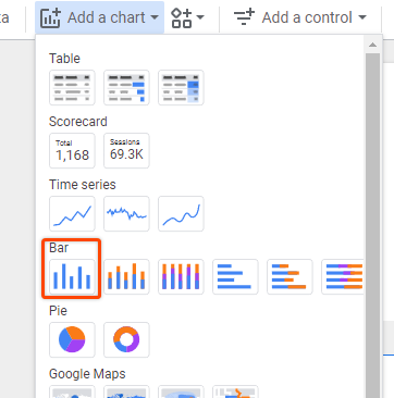
Creating reports using default elements
If you want a bit more customizable appearance for your funnel report you can use default chart elements from Data Studio to build something that looks like a funnel. The drawback compared to community visualizations is that it will take a bit more time and for funnels with more steps, it might get slower to load the data if you are not using a data extract.
There are a lot of different variations shared out there, from using just the scorecards to building out a funnel using a single bar chart per step (that is covered in this post).
Also if you don’t care about the visual presentation that much, but still want to avoid 3rd party connectors, you can even show a funnel report using a single elegant table.
For this type of report, you can check a detailed post by Mehdi Oudjida.
Step 1 – Blending data
Before we start creating charts to resemble a funnel we need to prepare and blend the data to be used in a chart. For the sake of example, I will use e-commerce action data from the GA4 Demo account, but it can easily be any other data source.
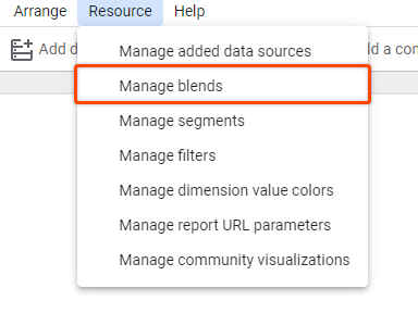
- Go to Resources > Manage Blends
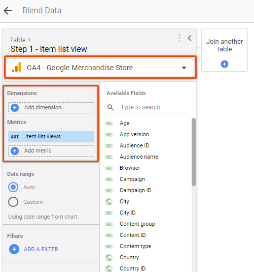
- Click on “Add new Blend” and select your data source for the first table. In my case, it’s the GA4 Demo account.
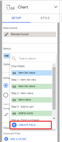
- Remove any dimensions and select the metric for the first funnel step. In my case, it will be Item list views.
- Click on “Join another table” and do the same for the second step, but now select the next step in the funnel, which will be Item views for me.
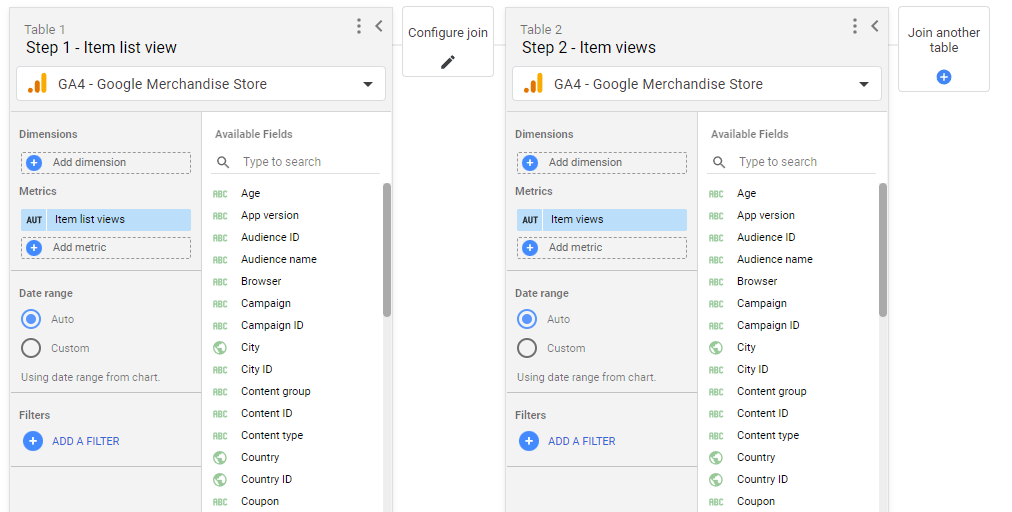
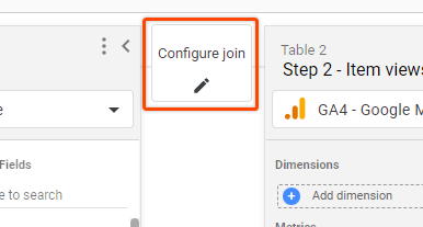
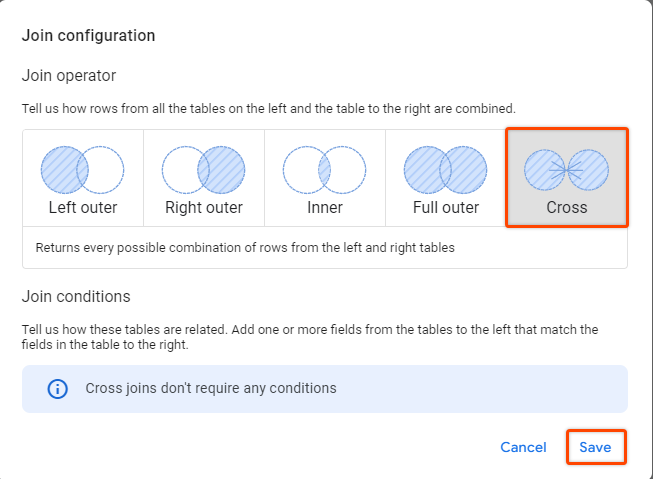
- Select “Cross join” from the “Configure join” section to include all possible combinations for each “table”
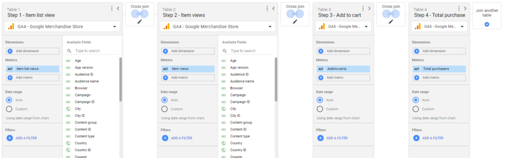
Repeat the process above for all funnel steps that you want to include.
NB! If your funnel has more than 5 steps in total, you will need to create multiple blends to workaround Data Studio’s limitation.
The finished data blend with all steps will look similar to this:
Step 2 – Creating funnel outline
Once we have our blended data source we can start adding charts.
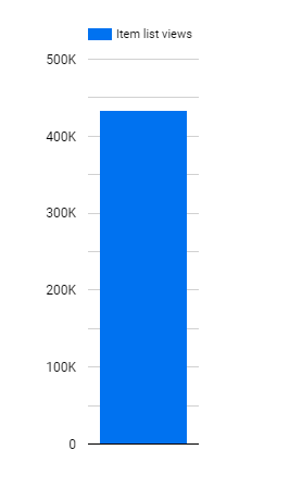
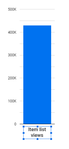
- Add a new bar chart, select a blended data source, and pick step 1 metric.
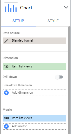
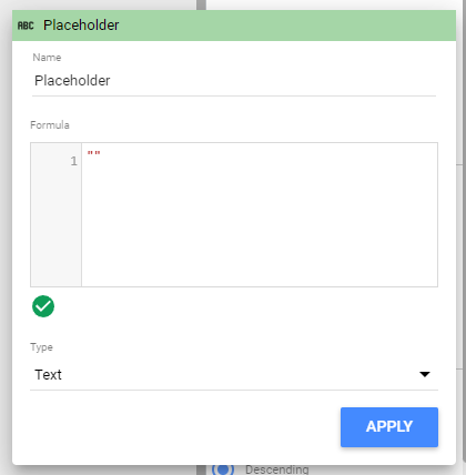
Since we don’t have any dimensions in the Blended source we will see the metric displayed as a label under the chart. We can remove it by creating an empty custom dimension on the fly, also it’s possible to name it from there. I will set it to an empty string and add the step name as a custom text since it will be more customizable that way.
- Click on the Dimensions and Create a new field.
- Enter two double quotes and hit Apply. It will now remove numbers under the label.
If you want to add a step name right from the chart, just add the step name in double quotes – e.g. “Item list views”.
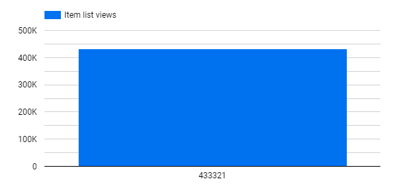
The label below the chart should disappear now, and we can resize the column to the desired width, that will be used for all funnel steps.
As we are going to copy this for all funnel steps let’s make a few additional adjustments right away.
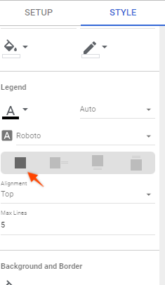
- Disable the legend above the chart. Go to Style >Legend >None
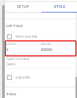
- Fix the size of the Left Y-Axis to be aligned with other steps.
Go to Style > Left Y-Axis and set Min value 0 and Max value depending on the max values you would expect to see. If your report is based on last month, for example, it could be lower than if you’re showing Year to date. I will set my range to 500K.
If you have a huge drop between the first and last steps, you might also allow first step values to “go through the roof” by setting a lower Max value to get more meaningful visualization for later steps.
- Add a text label for your funnel step if you haven’t provided any text already in the chart dimension as me. Also set the chart background color to white or to the color of the report background, because our charts will slightly overlap.
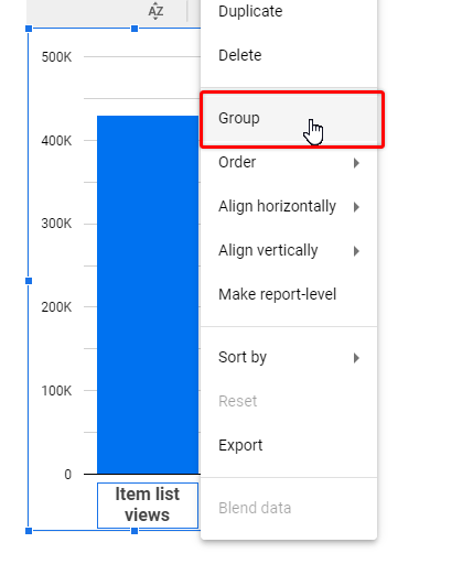
Once you are done with formatting and centering the label, you can group both elements together (Select both elements > Right click > Group)
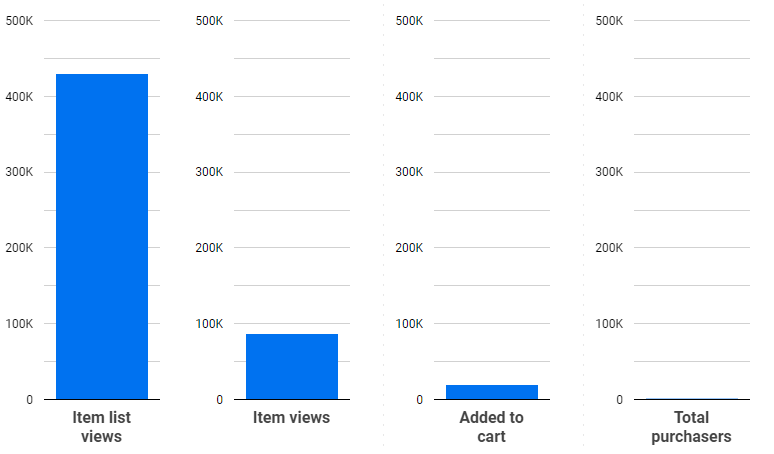
Now we are ready to add the remaining funnel steps.
- Copy and paste the group for each remaining step as shown below and try to align them vertically. For each copied chart select the corresponding metric from the blended data source and you should see a similar result as shown below.
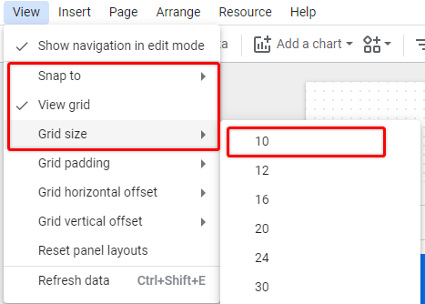
If you are having trouble aligning charts, you can enable a grid to make it easier.
View > Snap to > Grid
View > View grid
View > Grid size > 10
- Move charts slightly under one another to remove repeated axis values.
For each next step right click > Order > Send to back and move it slightly to the left so that chart values are under the previous step.
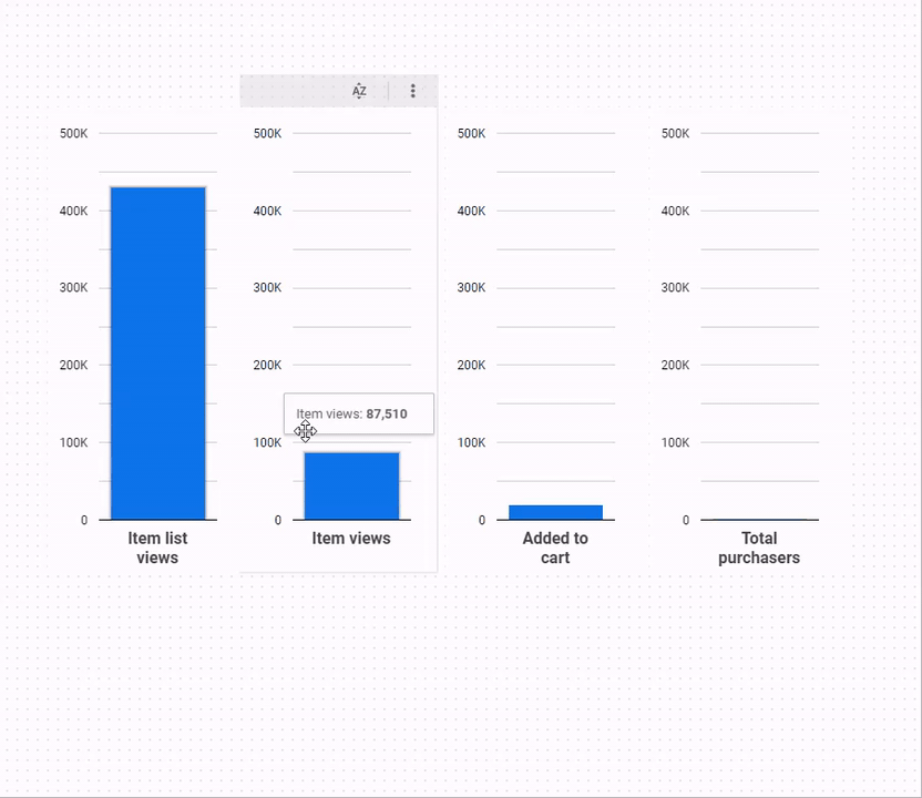
- Repeat this for each chart and you should have a visualization resembling a funnel
Step 3 – Adding step conversion rates
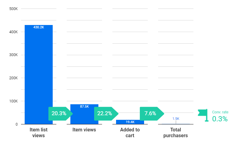
Next, we will add the most important part – step conversion rates. You can also add both – step and overall conversion rate for each step (I will show only one).
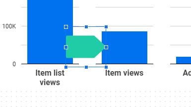
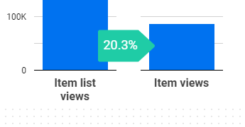
It’s up to you how and where you want to display this data since we are combining multiple elements under one report. In this example, I will use arrow label images and put a calculated conversion rate for each step between the columns, but you can also use built-in shapes from Data Studio.
- Upload a new label image from Insert > Image (or use a built-in shape to hold Conv. rate value).
This is how my label will look like
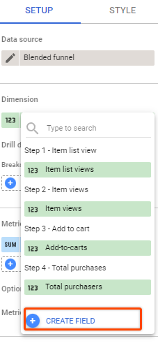
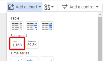
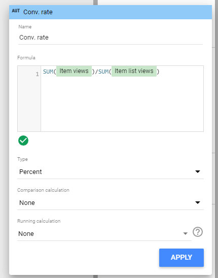
- Next, add a scorecard, and from the scorecard, metrics create a new field that will show the conversion rate.
- In the formula for Step conversion rate, we need to divide the next step user count by the current step user count. In my case Conv. rate from Step 1 to Step 2 = Item views / Item list views.
SUM(Item views)/SUM(Item list views)- From Type select “Percent” and save it
This is how your scorecard will look now:
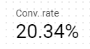
I will do a few styling adjustments so that it fits into my image label and then move it on top like this.
- Repeat the process for each of the steps
- Now, using a similar approach let’s add the overall conversion rate, which will be = the Last step / First step.
In my case Conv. rate = Total purchasers / Item list views.
Again, the styling can be whatever you want, since we are just using scorecards that we can put on top of anything. You can add more data labels, change/remove gridlines, colors, etc.
Step 4 – Dropoff rates and final refurrefurbishments
While the report above already could be used, you can add additional metrics that might be useful, depending on the use case. One such metric could be the number of users who drop from the funnel or the drop-off rate.
Since we already have blended data for each step there is no problem for us to create an additional calculated field and output that into our dashboard.
- Create a new scorecard and a custom field as a metric as we did for conversion rates. This time we will show the number of “dropped” users who haven’t reached the next step.
In my case for the first step, it will be = Item list views – Item views - Select Type – Number
Item list views - Item views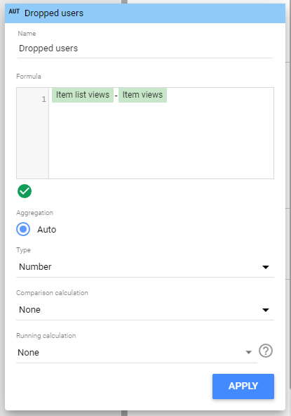
And the final output could be something like this scorecard under each funnel step.
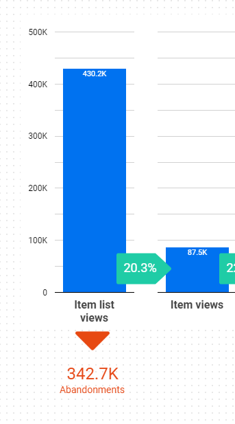
You can also add an abandonment rate if you want, but I think it’s pretty obvious what that value is since we have a step conversion rate on the chart instead of an overall CR.
The last thing I will do here is replicate the same abandonment volumes for each step and adjust gridlines to fit my preference.
Next steps
This is only one of the multiple ways you could display funnel data without using 3rd party connectors. You can adjust this report to be displayed vertically (using horizontal bar charts), and add additional metrics for each step to fit your use case.
Also, as mentioned at the start, if you are using a large dataset and have a lot of metrics and steps you may experience increased loading times since we are using a lot of dynamic elements for this funnel report.
In such scenarios, you may want to explore the possibility of Data Extract to speed things up.
I hope you found it useful and learned something new!
The dashboard template can be found here in case you want to explore it in more detail

Awesome Funnel, the best that I have found so far, thanks for sharing the knowledge
Hi
This guide is a life saver thank you. i have just one problem, im using page path as a filter and active user as a metric instead of events, the problem is that there are more users in step 3 than step 2. is there a way to make it a continuous step like the funnel exploration in ga4?