How to use reference lines in Looker Studio charts
Often the main purpose of any dashboard is to monitor and compare any kind of performance to historical data and make appropriate actions when you are not getting expected results. One of the useful features in Looker Studio that you can add to help this objective are reference lines. In this post, we are going to explore how to use reference lines in Looker Studio and how you can enhance your existing reporting.
How to add reference line in Looker Studio charts
Click on your chart and head to Style section. There scroll down until you find “Add reference line” button.
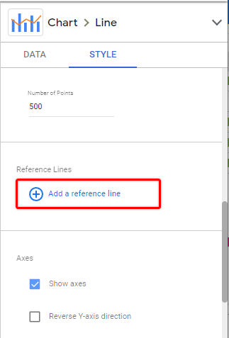
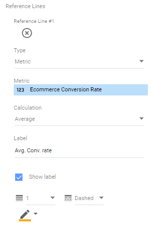
Once you add new reference line you will see a bunch of settings that you can pick.
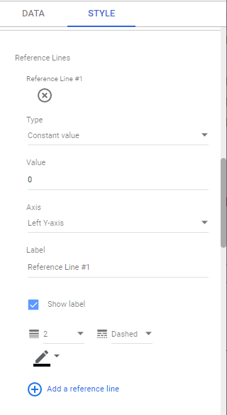
- Type – Allows you to select what kind of reference line it will be – based on static or dynamic values (metric or custom parameter).
- Value – Will set your reference line at provided value. For dynamic lines you can pick a metric from your data source or custom parameter.
- Axis – Allows you to attach reference line to specified Axis (useful when you want to have multiple reference lines).
- Label – Text that will be shown next to your reference line.
- Show label – Will enable/disable your text label.
- Styling options – You can adjust width, style and color of your line.
When you pick metric type line, you will see additional setting – “Calculation”.
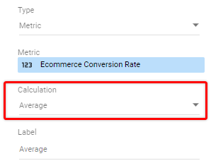
Here you can pick how the value for your line will be calculated:
- Average – Will show average value for selected date range for selected metric.
- Median – Will calculate median value, again, based on selected date range.
- Percentile – You can apply percentile calculation to your data and provide the percentile amount.
- Min / Max – Will set line to the lowest or highest value within date range
- Total – Data will show totals for selected metric in given interval
Once you adjust your settings, reference line will appear in your chart.
Now, let’s take a look at a couple of practical examples.
Use case #1 – Monitoring average values for anomalies
Adding reference lines with average values could make your Looker Studio charts more insightful, especially if you are reporting on any kind of advertising online, monitoring your website performance, or having other charts that display success rates of any kind.
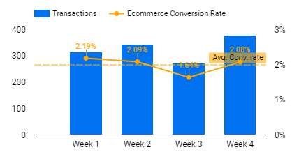
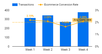
For example, to keep an eye on how your conversion rate compares to average value, you can add a Metric type reference line with selected conversion rate.
The setup above will give you the following result:
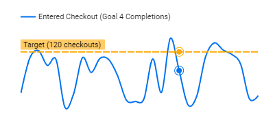
Use case #2 – Add static targets on your charts
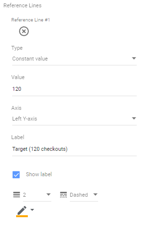
Often you have a pre-set KPIs to achieve, so it is handy to include those as a reference lines in Looker studio.
By selecting constant value and setting any kind of target you will get following result:
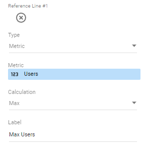
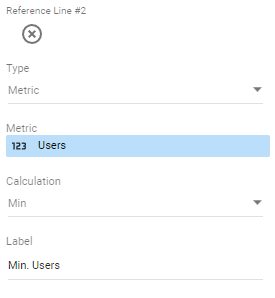
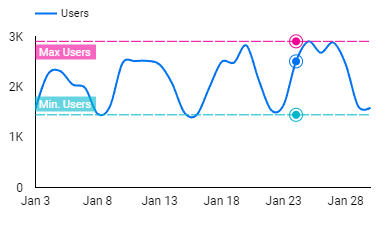
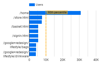
Use case #3 – Monitoring min/max range
In some cases you might also want to see the highest and lowest ranges for your incoming traffic, leads or other data. To see both – minimum and maximum we would need to add two dynamic reference lines for the same metric:
You will get the following two lines as an outcome:
Adding vertical reference lines
Reference lines work vertically the same way as they do with horizontal charts. To add a vertical reference line, select vertical bar chart report and add a reference line as we did in the examples above.
Limitations
Here are some current limitations to reference lines as described by Google:
- Dynamic reference lines are calculated only from values displayed in the chart (either filtered by date or other conditions), anything outside of displayed range/values is not included in calculations
- Reference lines can’t be added to 100% stacked charts
- Any other stacked charts support only contact value or custom parameter reference lines.
- You can use reference lines only for numeric axes. Date exes are not supported.
Summary
In my opinion reference lines in Looker Studio are a good addition to almost any existing dashboard to gain more insights in a shorter amount of time. If you would like to explore some of the examples by yourself, you can head to the dashboard template above and use templates in your own reports.
