
How to order bar chart values in Looker Studio reports
Ever struggled with ordering your Looker Studio bar charts in a logical way?
If your dimension values need some re-arrangement to make your report more readable, it might be challenging to do so if you’re just starting out with Looker Studio.
Luckily, there is a simple workaround to re-order your dimension values in any way you want, so let’s explore it step by step.
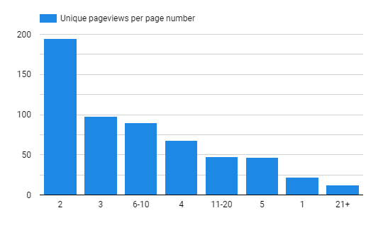
In the chart above you can see a default sorting or a bar chart based on the main metric. In my case, I have unique pageviews per page number bucket and they are shown in descending order based on pageview count.
It might be logical to order chart bars based on actual page order and not the event count to see the distribution of pageviews based on “depth”.
The problem is, that when you try to order them by dimension, Looker Studio will treat them as text values (as it should), and output the following result:
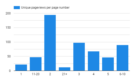
As you can see 1 is ordered together with 11-20, 2 with 21+, etc.
In your case, these might be any text values (e.g. weekday names – Monday, Tuesday…).
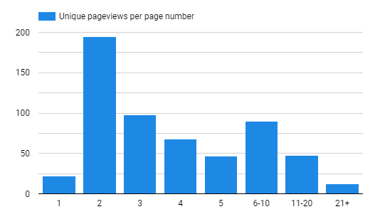
Our end goal is to achieve logical order based on “depth” that particular page was viewed:
As we can’t use our primary metric or dimension value to achieve the desired result, we will create our own field that will help to change the bar order.
Step #1: Create a custom field
When you click on your chart, you can edit your data source by clicking on the pencil button:
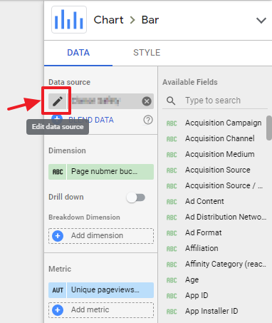
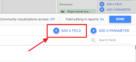
Then from the window that appeared on lower part of the screen select “Add a field”
Here we will use our existing field values to return the order number that we want to assign for each bar in a chart. To do that I will use Looker Studio function – CASE and the help of REGEXP_MATCH to match certain elements by a pattern, and the end result will look like this:
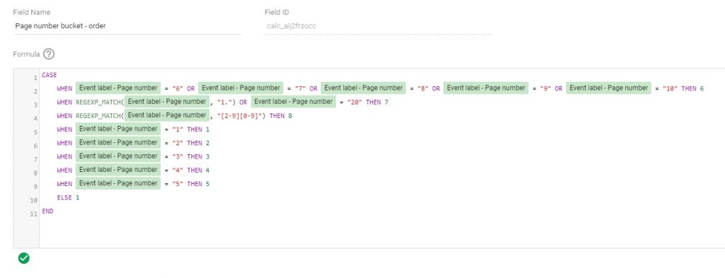
What’s happening here?
- We are using “CASE” to switch between every option we have and return a number that corresponds to the order where we want to see our dimension.
- REGEXP_MATCH is used to match several numbers at the same time, so that we don’t have to write “equals to” for every possible scenario.
By matching your primary dimension to a certain value you can return a number that will be used to order your item. It might look much simpler in your example if you have just a few text values like days of the week.
After you are ready with the formula, save it, and let’s apply it to our chart.
Step #2: Apply field to a chart
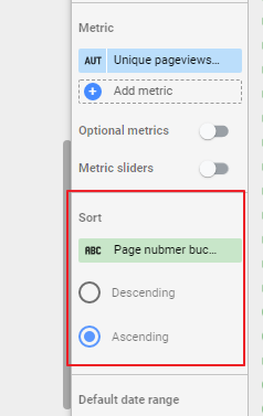
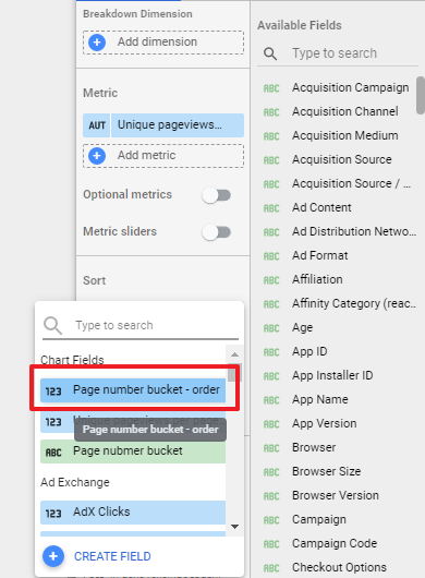
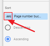
When the field was created head on to the Sorting section of your chart and select it:
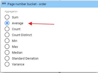
You might get an error initially on your chart after the field was selected. To fix that, click on the aggregation method and change it to “AVG”:
And voila! Now you should see your bar chart in the exact order that you wanted.
If you later want to adjust bar order, you can do that any time by editing the custom field that we just created.
Hope you found that useful and good luck!
